
Infinite ALL the Scrolls
With the relaunch of Time.com, I’ve had a number of people comparing it to Quartz. This happened when The Daily Beast made updates last year too, but it’s been more pronounced this time.
Either way, it’s something I still feel is miscategorized, especially when people bemoan the “infinite scroll”.
Well, call it “infinite scroll” if you like, but to me it’s the furthest thing from that. I fully admit the difference may exist only in my mind. Let me explain a little bit of history and something I learned many years ago at The New York Times.
When a reader makes it to the bottom of an article, there is a high tendency to lose them. That’s a general observation and not something specific to the Times. The common way people have tried to deal with this is by adding more links. Between the obligatory ads (seriously, why?), recommended articles, callouts to compelling content, “most popular” lists, third-party modules, and impassioned pleas to sign up for a newsletter, you eventually end up alienating the reader and they bounce.
Gone. Disappeared. No conversion. No new tasty ad impression to help keep the lights on.
So it was at the Times. We’d see a high number of people bounce, and wouldn’t it be great if we could entice them to stay a little longer?
In 2011 that gave rise to the oft-copied “Coming Up Next” module. It flew out from the bottom-right corner of the page as you approached the end of an article. It was conceived and built by Tahir Khan, and it was very, very effective. Bounce rate dropped by a significant percentage.
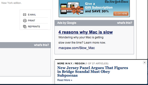
To me, the main conclusion was this: readers are often paralyzed by choice. They’re overwhelmed with options. This module was clear and different from everything else, and it solved one big problem:
Don’t make the reader think.
It didn’t try to guess from a list of curated items or present a recommendation based on browsing history. It simply said, “Go here” (arbitrarily, the next article in a section), and a significant number of people did.
It was genius.

In building Quartz, this was one lesson I took with me. In our execution, the idea wasn’t to implement “infinite scroll.” It was about taking the “Coming Up Next” module to its logical conclusion: remove the need to click.
What most people don’t know is that when you load a page on Quartz, whether it’s the homepage or an article, you load all the pages.
That sidebar on the left-hand side (we call it the “Queue”) typically contains 18 to 26 articles. When you open the page, we load a large string of JSON and save it all locally. It’s actually quite inexpensive, and it means that when you click on any article, it’s there immediately. Only images, if they aren’t already cached, are left to load.
So as you approach the end of an article, there is effectively no cost to “preload” the next one. It’s already there.
You don’t have to read it. It will never be counted as a page view unless you scroll beyond a generous threshold. We were never trying to game page views. Page views are evil anyway, but that’s a different story.
So in the end:
simple reader choice (effectively none)
+ preloaded data
= amazing page depth
This is the part where I disappoint people and provide absolutely no numbers to back any of this up. Sorry. It’s a combination of memory and keeping promises.
However, I’ve seen the page-depth metrics of a number of different websites. Ours was several times higher, typically somewhere in the ballpark of three to five times.
This isn’t a magic bullet. Even at Quartz there were things we didn’t plan for, such as a large ad at the end of every article instead of every second or third article. Also consider that if a reader is rapidly skipping through content, that’s a lot of material to push into the DOM. Medium’s approach avoids this problem.
So yeah, forgive me if I wince at the term “infinite scroll.”
It’s not quite that simple.